![]()


email us: vostaldesign@attbi.com
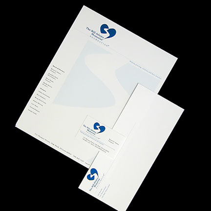 |
The Bill Adams Memorial FoundationThe Bill Adams Memorial Foundation was started to help grieving families find support to help them through the grieving process. The design was inspired by a conservsation. Murial Adams said that after her husband, Bill, died her heart had no path to move forward. This foundation intends to help the bereaved find their path back to the world |
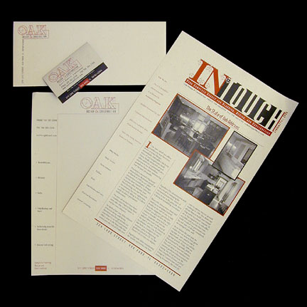 |
Oak Design & ConstructionOak Design & Construction wanted an image change from their old identity, Oak Construction. The goal was to emphasize Oak's full service design capabilites while retaining the core roots of the company. The logo also had to applicable to trucks and signage. |
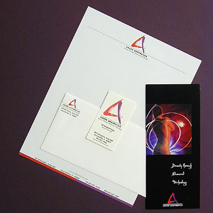 |
Laser AestheticsLaser Aesthetics needede an identity that would convey professionalism and beauty in the very competitive field of cosmetic enhancement through laser technology. |
 |
Chicago Metropolitan Fire PreventionCMFP needed a new identity. The previous logo was a fire extinguisher in a flame. They wanted an updated, more sophisticated look. The logo works well on their trucks and is easily distinguished from the competition. |
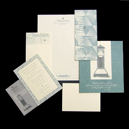 |
The Foundation of West Suburban Health CareThe Foundation needed an identity that was distinctive yet was clearly tied to the West Suburban Health Care logo. We choose the diamond motif because the the Kiosk of Giving located in the Hospital lobby features triangular copper plate enscribed with each donors name. |